Pages

Tuesday, 19 June 2018

2 nejdůležitější aspekty úspěšné kresby

Ahoj Tě znovu,

To je cvrkot viď? Novej příspěvek na bloggu. Tak nějak jsem si předsevzal, že se tady budu snažit vždy něco plodit 20 minut poté, co dojím, abych si z blogaření vytvořil solidní a hezký návyk, takže se můžeš těšit na přehlšle informací (to víš jím tak nějak často :-)) No a 20 minut jsem si zvolil proto, abych začal pozvolna a mě se to nepřesytilo a já pak zase neskonal a půl roku nic nenapsal.

Dneska bych se rád opřel do dvou základních pilířů kresby a reprezentativního umění obecně, o kterých jsem přesvědčen, že jsou pro solidní tvorbu esenciální (né, že bych to jako vymyslel - převzal jsem to od jiných - Třeba Steve Huston. To je dravec! Určitě se mrkni na jeho práci přes google). Je jedno ať už se jedná o rychlou skicu na novinový papír, malbu či nástěnnou fresku - tyto základní principy jsou uplatnitelné za jakýchkoli podmínek. Těmito základními prvky jsou:

GESTO
STRUKTURA

Zjednodušeně řečeno GESTO je fluidita, "ladnost", živelnost representovaného objektu. Je to základní prvek, od kterého se všechno odvíjí. Je to energie, který daný objekt obsahuje. Analogicky v muzice se jedná o melodii a celkovou kompozici, která drží všechno pohromadě. V tanci je to celá sestava baletky, v literatuře je to zápletka atd. atd. Jedná se o konektivní prvek, jedná se o duši, která spojuje jednotlivé prvky ladně do sebe. Je to například ladnost přechodu ruky od ramene přes loket až po zápěstí v případě figurální kresby)

Obr. 1. Příklady GESTURÁLNÍ kresby - Je dobré si dát max. 1 až 2 minuty na tyto rychlé skici, aby jsi neměl/a čas být přehlcen/a detaily - je dobré být nucen zachytit esenciálno pózy - právě tu fuiditu:
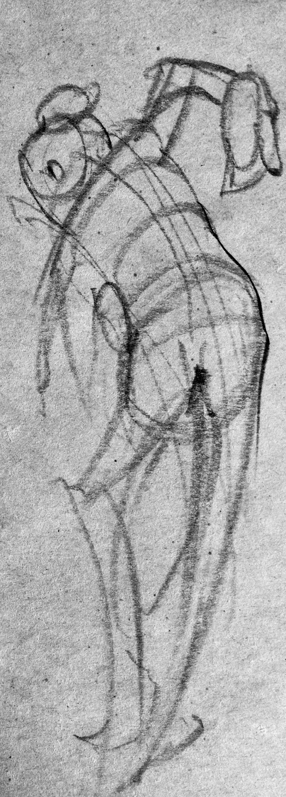

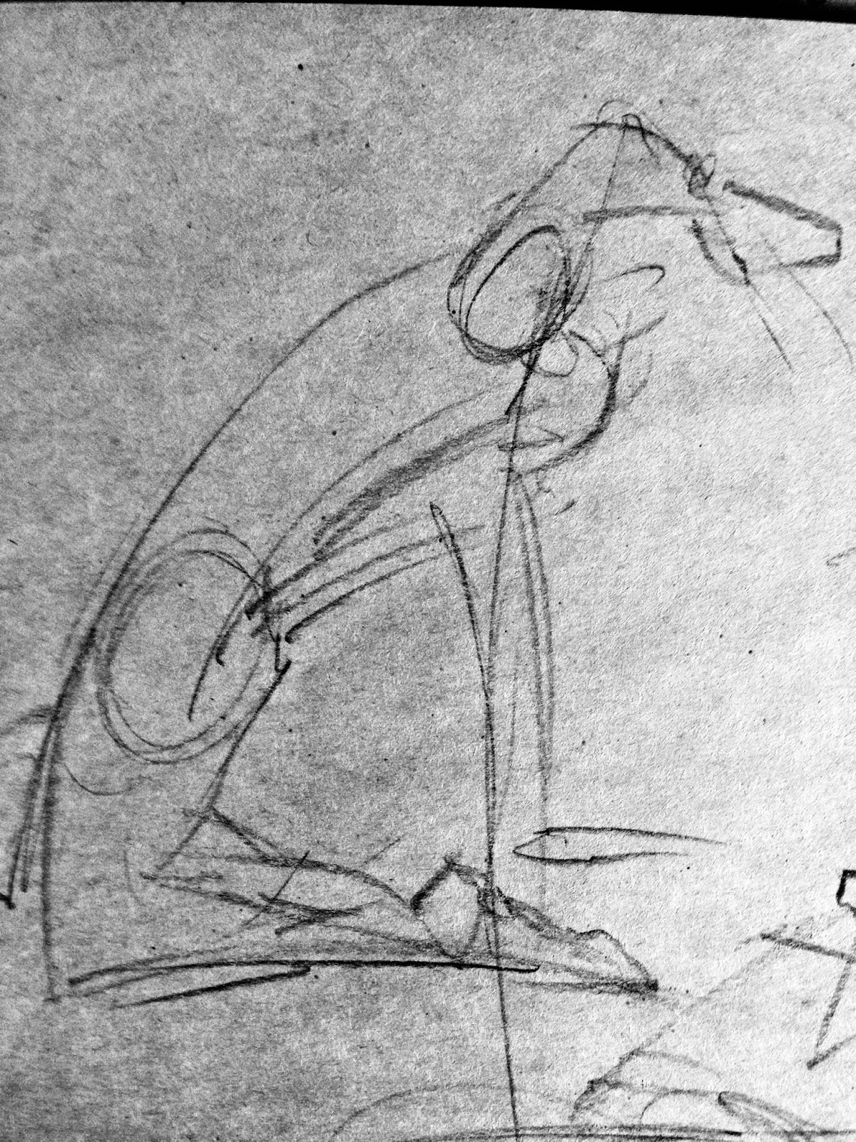

Zjednodušeným vyjádřením STRUKTURY je třídimensionalita, architektura daných jednotlivých částí zobrazovaného objektu, ať už jde o cokoli. Je to to, co dává objektu pocit hloubky, výšky a šířky. Je to naše snaha ziluzionizovat (hmm pane to je mi slovo :-) ) pocit 3D na fyzičnu a naturální 2D povaze papíru, plátna, zdi. Analogicky do muziky převzato, úlohu strutury plní akord, nota, či jednotlivý nástroj celého orchestru. V literatuře to jsou jednotlivé postavy daného románu, prostředí apod. V tanci jednotlivé kroky choreografie...

Obr.2. Studie STRUKTURY na příkladu paže a palce. Jak mužeš v případě paže vidět pod strukturální analýzou je ve formě takzvaných "ghost lines", což by se dalo volně do češtiny přeložit jako "Mlhavé linky" stále vidět moje gesturální kresba. Tím chci říct, že Gesto předchází Strukturu:

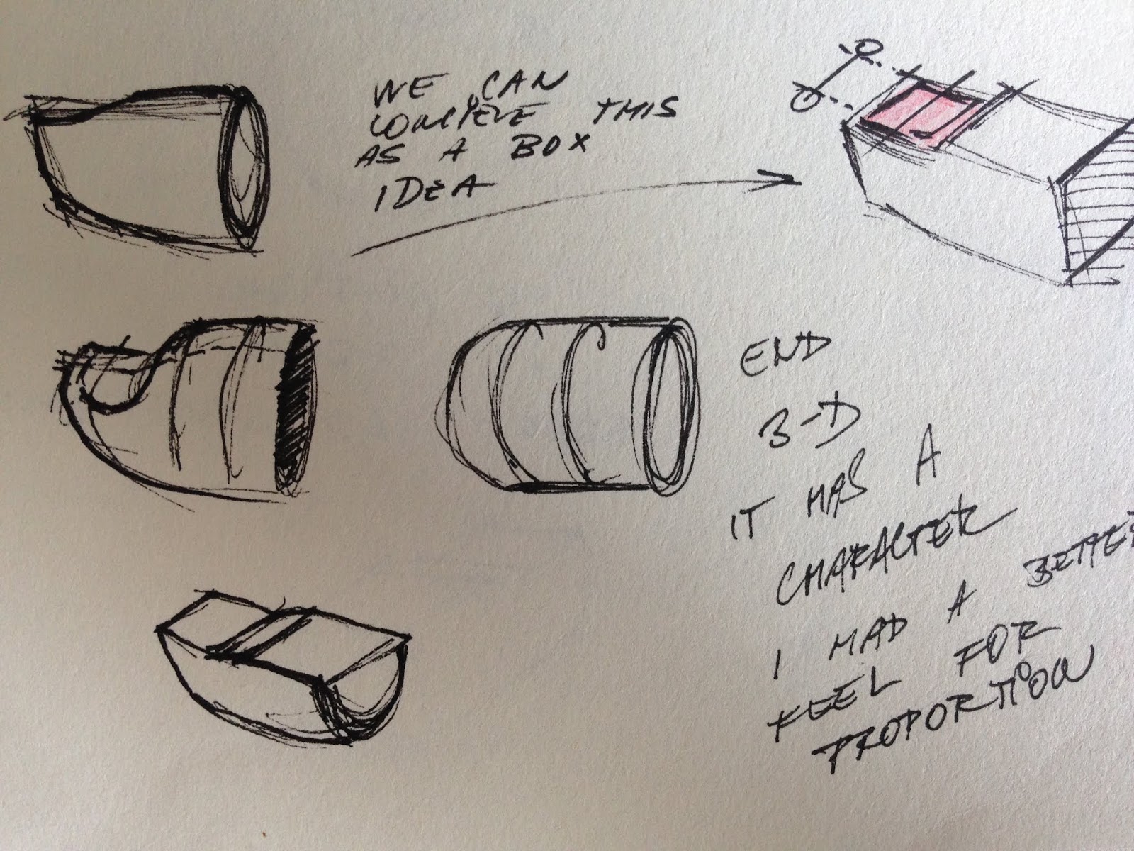

GESTO je velmi těžké racionálně uchopit. Je to ta schopnost pravé hemisféry, to vcítění se do objektu a jeho ladnosti. V gestu se můžeme snažit dosáhnout mistrovství celý život a nemusí se nám to povést - proto musíme mít rádi tu cestu za ním. STRUKTURA je naopak vcelku dobře pochopitelná. Je to prvek, prostředek, kterým víceméně popisujeme danou věc pomocí různých pomůcek - například šrafa, stínování apod. S pochopením této problamatiky Ti mohou pomoci lidé, kteří už si prošli trništěm a tak Ti můžou mnohdy zkrátit cestu o desetiletí. Proto je dobré si vyhledat mentory. V realmu portréru a figury to může být například Stan Prokopenko na youtube. Z knih bych pro začátek rozhodně doporučil knihy Andrew Loomise. 

Jenom lehce odbočím:

Věřím, že v kresbě a malbě a pictoriální tvorbě obecně neexistují pěvně stanovená pravidla. Pouze spíše poučky - doporučení vycházející z praxe. Když Ti někdo bude zatvrzele tvrdit, že něco nesmíš! měj se na pozoru a vždy to filtruj přes svoje racionálno a svoje vědomí. Např. když Ti řeknou, že se tužka nesmí mudlat je potřeba to brát z rozvahou. 

Výše zmíněný odstavec uvádím jako prerikvizitu pro všechny "poučky", kterými tady budu házet do pléna. Prostě je potřeba to brát s klidem :-) 

A tu je jedna z oněch pouček (čti doporučeních),  která přinesla léty ověřená praxe statisíců umělců po selém světě: GESTO VŽDY PŘEDCHÁZÍ STRUKTURU. Je to už dáno povahou oněch dvou aspektů - Gesto je konektivita konstrukční součástí. Gesto je celek, konstrukce jsou dílčí části. Proto je vždy dobré, ať už se jedná o dílo jakéhokoli rozsahu, začít uvolněně gestem a strukturu "lepit" na něj.

Ať se jedná o jakékoli umělecké odvětví mezi gestem a strukturou existuje tzv. Fine Line - ideální rozpoložení řekl bych. Je to akt balancování, kdy vyvažujem oba aspekty proti sobě. Když máme dílko pouze gesturální, může působit mlhavě bez solidních základů a ploše. Máme-li v díle zase moc struktury bez patřičné fluidity může náš záměr vypadat jako takový malý Frankenstein. 

A to by bylo pro dnešek asi vše. Děkuji Ti za Tvůj čas čtení těchto řádků. Pokud by jsi měl/a něco konkrétního na srdci, čemu bych se mohl pověnovat nebo vysvětlit, určitě neváhej nechat komentář dole v sekci pro komentáře nebo se vždycky rád dozvím, jak svoji práci zlepšit, takže i konstruktivní kritika je vítaná. Publikovat na blog budu poměrně často a jestli nechceš, aby Ti něco uteklo, můžeš se přihlásit k odběru novinek - stačí v pravo zadat tvoji mailovku (kolonka Subscribe for a news). 

Peťa


A teď už jenom sluchadla (s podcastem), káva a hurá na comiksy, přecejen tam visí deadline


Monday, 18 June 2018

More "How to draw" blog posts for the near future!

Hi there to you all, good brothers and sisters,

It's been a while (half a year) since I wrote my last blog post here about how I work and what I think is the fundamental principals if one wants to create representatively- meaning how to draw, paint or otherwise depict things that we are somewhat familiar with. I can't speak about abstract art (although there's a place for it in representational art as well but about that another time! )

Till now this blog has been purely in English but I decided to make it bilingual for sake of my brothers and sisters from Czech Republic. Yes, you guessed it - the second language of this blog is Czech (Since I'm a proud Czech citizen and I'm somewhat proficient at it) If you would be interested to look at the writing in this language (at least for laughs that you're not able to discern a single word), you can check the right side bar at the top for a language switcher. 

This blog is about what I do, how I do it a why I do it and WHY! it could be a good thing for you to do as well (benefits as calming down, letting out all the stress from hard day's work and maybe to have something to hang on the wall in your bedroom)

I also love to talk about life in general - you know - philosophy of art, psychology in turning things around (you know I was a construction engineer that burn out heavily) and so on. 

For those who don't know me yet (majority of you), you can check my official website:

https://stranikart.com/en/

WHAT DO I DO IN THE MOMENT?:

As a freelance illustrator I'm currently working on a comic book in collaboration with comic book freak (in a good sense) from Prague named Jonas Ledecky. If you're not familiar with Jonas you can find him here:

https://jonasledecky.myportfolio.com/work

We should release the comic book sometime in the heat of the summer - it is not set in stone yet but I definitely should be done with it around this time. Comic book is based on the famous Czech Writer -  Karel Čapek and his detective short stories from the 30's called "Povídky z jedné a druhé Kapsy" (It is a mouthful isn't it? :-) ) 

Jonas is a comic book freak which I admire a lot in him. You know comic book is a brutal area of creative endeavours. You have to rely heavily on your imagination and that's hard and painful believe me. In future posts I will touch on this topic how I make this things easier (or try to). Since this is a blog about visual creations I attach some panels from the short story that I'm about to deliver:


Night scenes would be on the dark bluish background and all the scenes within daylight would be with an ochre fill. Highlights would be brought out by adding white to simulate the work on toned paper (Although it is a digital colorising). I ink the drawing by hand mostly using black ink and fountain pen. 

So that's all for now. I wanted to check up with you and tell you that we can have an interesting relationship in the future where I can share some useful tips with you about my creative process maybe to give you an idea for your work or maybe to selfishly receive some suggestion from you how to improve my work further. I hope for a mutual artist's relationship and that we will engage together in foreseeing future. 

Best regards, Petr

Tuesday, 12 June 2018

Bloggaření o tom jak kreslit!

Dobrý den člověče,

je to chvíle (půl roku), co jsem tu naposled na nástěnku "přilepil" nějaký ten příspěvek o tom, jak tvořím a co si myslím, že jsou zásadní principy, chceme-li tvořit representativně - myšleno tak nějak kreslit, malovat objekty, se kterými jsme jistým smyslem familiérní. O abstraktním umění bohužel nemám páru! (Nicméně i abstrakce má v representativním umění místo, ale o tom až jindy)

Do teď (myšleno do mého posledního příspěvku z lednu letošního roku :-) ) jsem vedl tento blog jen v Angličtině - to víš tak nějak se do toho jazyka obout bylo potřeba. To se dneškem mění. Napravo tohoto blogu, na tom sloupci, kde je bio o mně a archiv a nějaké ty odkazy je i možnost nastavení v jakém jazyku můžeš příspěvky číst. Nicméně všechny staré příspěvky zůstanou pouze v Angličtině (To celý překládat - to by byla práce na celý prázdniny). Máš-li zájem přečíst si i tyto starší příspěvky klikni si sem:


Tento blog je hlavně o tom jak co dělám, proč to dělám a PROČ zrovna i pro Tebe by mohl být obor representativního umění přínosný! (benefity jako že vyklidníš, vyseparuješ myšlenky co Tě trápi atd. atd.), nehledě na to, že si můžeš zplodit něco na stěnu, co tě bude těšit)

Nicméně i filosofie života a psychologie si myslím, že jde v ruku v ruce s tvořivostí, takže se můžeš těšit i na tyto aspekty probírné do hloubky.

Pro ty, co mě ještě neznají (majoritní většina z vás) vás zvu mrkout na mé ofiko stránky: https://stranikart.com/cs_cz/

Momentálně se věnuji tvorbě komiksu s Jonášem Ledeckým, který by měl vyjít někdy kolem prázdnin - nevím jak to je s tiskem a produkcí nicméně já mám deadline nastavený takhle. Komiks je na základě povídek od Karla Čapka s názvem z jedné a druhé Kapsy. Scénář má komplet na starosti Jonáš. Kdo byste neznal tohoto komiksového výtvarníka tak tu je link:


Jonáš je "trhač" v dobrém slova smyslu a jeho disciplínu pro komiks (Je to těžký - až brutální obor) se snažím s jeho dohledem nasát, jelikož si myslím, že je to pro rozvoj jeden z nejlepších oborů (musíš ty scény z hlavy vytvořit - tvoření z hlavy bolí, tomu věř) 

Tu je pár ukázek z připravované povídky, kterou mám na starosti:


Noční scény budou podlity lehce desaturovanou modří a denní scény okrovou žlutí. Asi tak nějak jako by se tvořilo na tonovaném papíře, který Ti už svým vzevřením poskytne střední hodnotu šedi a ty pak buď přistínuješ pasáže co jsou tmavší nebo použiješ bílou křídu pro vše co je světlejší. Nejsem moc fanda tvorby v plných barvách - může to být moc pouťové a tím pádem odvádět pozornost od příběhu jako takového. 

JO PŘÍBĚH SE PTÁŠ?

Je to vlastně taková "lidská", náturou právě hezky česká detektivka z let první republiky, prostě z let poctivých četnických služeb. Víc Ti asi zatím prozradit nemůžu.

No nic to je tak všecko pro teď. Musím jít tvořit. Takže se těš (jestli jsem Tě namlsal teda) na příště. Můžu se opřít do toho jak dělám komiks, jak skicuju, či třeba maluju v oleji, jak přemýšlím o filosofii v umění. Poskytuju Ti to oplátkou za to, že svůj drahocený čas tráviš čtením těchto řádků.

Peťa


Monday, 1 January 2018

My First Imaginative Fantasy Picture In Adobe Photoshop

I have always loved dragons, warriors, heroes etc in various fantasy novels and stories. One that stands out obviously is the whole franchise from middle earth. Recently I read one trilogy called "Summoner" by Taran Matharu and I have to say It was really refreshing and the plot and the whole universe is quite unique.

https://www.goodreads.com/series/130699-summoner

My picture is a scene that I imagined while reading the pages from the first book "The Novice" where the main character abandoned his home with his Imp that resembles a small dragon. In the scene Imp made a fire for our main character to get him little bit warmer.

I decided to do this work based on the story that haven't gotten so much artwork yet because It is quite new book and I didn't want to be biased in any possible way (If you think about it that's quite harmful in the case of LOTR movies - because now we have a firm picture about environment, scenes and even the appearance of characters in the given universe)

I started project with pencil on paper:


Sketch #1

This sketch and the one that follows were done from imagination. That is to say that I erase a lot and chase the idea quite religiously - It is not a loose sketch - I spent about an hour on each of these because of that. I would love to have that ability to sketch something in 5 minutes :-)

in the pencil sketch above Imp is right in action of spitting the fire and the whole composition is quite flat so I decided to give it a little perspective and since in the book the Imp is wingless I decided to put the wing out of the picture as well. After some thought I realised that it would be better to portray the scene as a "aftermath" with the fire right in the picture. For next stage of sketching I went right into photoshop - because erasing in this program isn't that cumbersome. 


Fletcher (the main character) and the Imp Sketch #2

From this sketch I proceeded to the final painting. I downloaded a loads of reference images - about dozen forests, fires, characters near the fire, dragons etc. I didn't rely on any given reference so much always striving to make the appearance my own. 

I have to say that painting and drawing from life is much more relaxing and easier than to make a scene completely out of your imagination. The most rewarding thing on this kind of work for me is the final product when your vision is somewhat realised. 

I have to say that in the original series the imp's appearance in "The Novice" book is lot more smaller and can actually fit behind your neck as a small ferret so I deviated a lot in this case. I used it only as a inspiration. 

So here's the final painting:


Fletcher and Ignatius (digital)

In overall I'm happy with a picture and the whole process of picture making. In the hindsight I have to admit that the first pencil sketch had more impact composition wise - it makes you think more about the scene out of the frame (the fireplace isn't included in the picture) and hence makes it maybe more interesting. Maybe the final painting is too literal..

What do you think? Let me know in the comments below.

Pete

Thursday, 21 December 2017

About this time - Gratitude and feeling of contribution

Ahoy all you good people, how's the festive season working for you? I chose to give you heads up by "Ahoy" exclamation not because I would be some kind of marine enthusiast or some kind of pirate but because this exclamation is the closest one to Czech "Ahoj"

Recently I'm thinking about an idea to have my blog bilingual (English/Czech) but I haven't come with solution  yet how to put it in action. If someone would know how to do that here with Blogger platform I would be more than grateful!!

Since I pointed on the topic of gratefulness please let me give a chance to say that I'm so glad, that there's some people who enjoy my art and I can have that warm feeling of contribution. This year some of my paintings find a home in several places in United States due to the sales made through auction portal dailypaintworks.com 

It's nice to know that my "touch" can reach places like North California (in the case of painting called Chill, State of Georgia (painting called Spotted), Massachusetss (painting called Delivery), Connecticut (painting called Turban Fellow) and Texas (Hey a'll) (painting of John Scofield)

Some of the paintings on my dailypaintworks pages are not for sale, because I gave them away as gifts to my relatives or as a farewell "thank you" to my former chief. I also had a great commissions (portrait of dogs for my former employer)

I'm looking forward to put my efforts to make myself a better painter and to provide for art lovers more products with ever increasing quality. That feeling that someone loves your work and actually is keen to put a value on the effort is invaluable. I love doing my work and I love even more to see it hanging in someone else's room across a globe (like in this case)

I would not like this post to be a picture less post so here's my still life study (charcoal on paper):


Stay festive people, it is coming..Pete


Wednesday, 29 November 2017

What to do if one's ill to "stay in shape"

Last week I had a flu. It wasn't anything bad, just clogged nose, slight fever but it was really hard to concentrate on any bigger endeavour. So I made just few sketches from my bed.

The first is done as a memory with a chat that I had in October with a principal of a JO-JOO circus that visited our town - mr. Jaromir Joo. I made some sketches of Siberian tigers over there (see my old post here)


It is in my watercolour/gouache sketchbook and is about 7x8 inches done in gouache. Picture is done from photograph that I'd taken before he allowed me to have a peek through the open window of the cage with his 600 pound Siberian tiger (To make my self a picture without bars of that cage). After that we had a chat about tigers and life in general. He is a clever fellow that has contributed to the rescue of Siberian tigers with 25 cubs bred within his circus.  

Second sketch is about 8 inches tall and it is from a photo of a miner from internet. In this case I worked with oils. It is hard to work from life if you're confined within your room in order to beat a flu out of yourself. Those sketches are means of staying "in shape" and not to forget your craft. With any given craft it's like a memory training or going to the gym - after while your skill can fade a bit if you don't use it often. 


This is not to say that I have acquired any sufficient skill for painting and drawing I just wanted to remain the skill that I have so far :-) Please notice that I'm aware that there is a long way to master my craft. I want to point out that I think it's important to maintain your skill (stay in shape) in some degree even if you feel like doing nothing. 

So stay in shape guys in whatever is your vocation. 

Pete


Wednesday, 15 November 2017

NEW Painting - Winter's coming.

Hi all of you. I've been thinking that would be nice to share with you how I made my recent painting called "Winter's Coming"

I visited my brother's place on 31st of October to help him just a little bit with the wood that he uses for his heating. After some chopping and cutting I made a few pictures of him in the cellar making finer wood chips. So here's my reference:


I got pretty lucky that a picture in its self had a quite good staging. I tried to get myself going with ballpoint pen preliminary (plus white chalk on toned paper):


BW preliminary sketch for "Winter's coming"

While doing a sketch I realised that in order to tell the story and the movement i.e. "gesture" I have to emphasise few things - so I intended to do the hands and the axe little bit bigger to push them closer to the viewer and to suggest more movement in my brother's right hand. After that I proceeded to small colour study in oils:


Preliminary colour study for "Winter's coming (4x6 inches on canvas) (you can see a little bit bigger hands and the axe and action lines in his right hand)

For this study I pushed colours in his hat and in the axe toward green to compliment reddish colour of his trousers. I declared that a warm grey of the hoodie is ideal and it will support both compliments. After that I proceeded for a final painting.  


Winter's coming - beginning stage

Above is my beginning stage of the final painting. I started with a gesture, emphasising hands and the axe even more and putting even more movement to the whole body. I even tried to put more "air" into the back of the hoodie. I strived to have little bit cartoonish feel (something like Norman Rockwell). I would like to point on the fact that it is not about a mere coping of the photograph but more about telling a story and push your narrative as further as possible (but still maintaining believability) So this is basically the third time that I draw a picture freehand. 
As for materials side of things I used a MDF board with two coats of white gesso and final coat of transparent gesso with tooth which I like so much (I don't like it slick). I used water soluble oil colours Cobra and great brushes Rosemary and Co. As I worked I used my photo reference in BW for proportions and my colour study for my mixtures. 
Painting took about 3 days of interrupted work (I've got troubles to start - yep you have that right - procrastination) and I tried to stand the whole time in order not to lose sight of a whole picture and to maintain gesture within the picture - you can lose it so easily when you get into detail. 

Winter's coming (17x24 inches, oil on gessoed board)

I love this kind of narrative work. There's something familiar in it I think even for a person who never met my brother. I hope that picture can give you a feeling of home, warmth or maybe makes you think about state of mind of the subject (I made him look somehow mysterious)
My opinion is that it is not about a single interpretation but more about what you (my audience) can derive from it based on your experience, feeling etc. And that is so magical in art I hope and that's the reason why I love it so much.

Stay warm, winter's coming! Petr